Recently, I shared some background on the creation of the covers for my Summer 2016 picture books. Now, let's get to the novels!
From time to time, it makes sense to try a different approach for the paperback edition of a book, and that's what we did with Attack of the Alien Horde. I sat down with designer Greg Stadnyk and looked at a bunch of superhero comics, movie posters, concept art, and fan art. We drew a lot of inspiration from these graphic images.
Dusty Higgins brought his own interpretation to the idea and delivered this awesome piece of art...
You'll notice that we decided to play up the book title versus the series name, a reversal from our position on the original edition. Greg came up with a TON of options for the title treatment, and I'm super in love with our selection--it's high impact and dramatic. Everything yellow is going to be printed over foil. It's ridiculously cool.
Now that we had a new direction for the series, we needed to come up with a cover for Book Two: Rise of the Robot Army (6/14/16). We knew that we had to feature the robots, and along with Miles, we wanted to incorporate Miles's best friend Henry, as well as new character Lenore (aka Skip). Having this many characters on the cover made our simple graphic approach much more challenging, but Dusty WORKED IT OUT.
That lead robot and Miles's cape will print over foil for an eye-catching, shimmery effect.
I have two YA offerings for Summer 2016. Cure for the Common Universe (6/14/16) by the wonderful Christian McKay Heidicker follows 16-year-old Jaxon, who may or may not be addicted to video games. If you ask me, he is. His father and stepmother agree with me, and on the very day that Jaxon secures his first real date with a human living young woman, his parents send him off to video game rehabilitation. Now, Jaxon has less than a week to "beat" rehab if he's to make it to his date. Fun, right?
Cure has the big-cast appeal of It's Kind of a Funny Story, The Breakfast Club, and/or Girl, Interrupted. In rehab, Jaxon will meet like-minded individuals, though he will go out of his way to prove that he's nothing like Soup, Aurora, Meeki, or the other members of his guild. And he will have to confront his shitty worldview, much of it shaped by the games he spends hours playing every day.
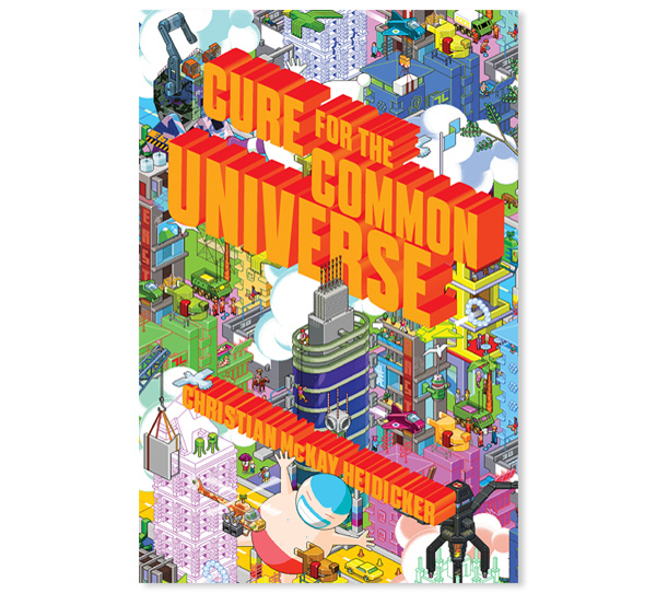
Christian did a really fun scavenger-hunt cover reveal a few months back, and he gave props to eBoy, who created the shockingly cool cover art. But let's back up a couple of months. Greg Stadnyk, the designer for the novel, was really excited about the prospect of working with eBoy on this cover, and I was immediately sold on the idea. eBoy's artwork perfectly captures the hyperrealistic worlds Christian's characters spend the bulk of their time in. Initially, we wanted eBoy to create a new piece for us, showcasing the cool setting (the Utah desert), the rehab facility (Video Horizons), and our big cast of characters. But our budget allowed for one character and one simple building--those pixelated worlds don't come cheap!
Still, we asked eBoy to give it a try. The early drafts were pretty bleak. The art was cool, but the whole point in commissioning eBoy was to get an over-the-top, jam-packed video game extravaganza. What we got reminded me of the smallest Lego sets you can buy, the ones with one figure and his hard hat and maybe a cactus. We were still eager to work with eBoy, so Greg and I pored over their archives and licensed a piece of art that fit our vision. That's how we ended up with this masterpiece:
The title and byline will be printed in a fifth color and will have spot gloss on them.
Finally, we have Remix (7/5/16) from the uber-gifted Non Pratt, with whom I worked on Trouble, a novel I was very happy to inherit when I started at S & S. Like Trouble, Remix is about friendship. While Trouble explored the early days of a friendship destined to become of the best quality, Remix looks at the struggles two best friends must overcome to keep their friendship intact.
The story is told from two points of view: Kaz, the more responsible one, who has recently had her heart broken by the boy she thought she'd be with forever; and Ruby, the spontaneous one, who has never been much for romance but who refuses to acknowledge how much she cares about a boy she was, until recently, snogging. (The novel is set in England.) The lives of our two protagonists are about to change dramatically. For one, for their final year of high school, they will not be attending the same school. And two, Ruby's big brother, whom she adores, is moving to California. The girls, mourning their soon-to-be losses, decide to go to a weekend music festival to bond and forget about their worries.
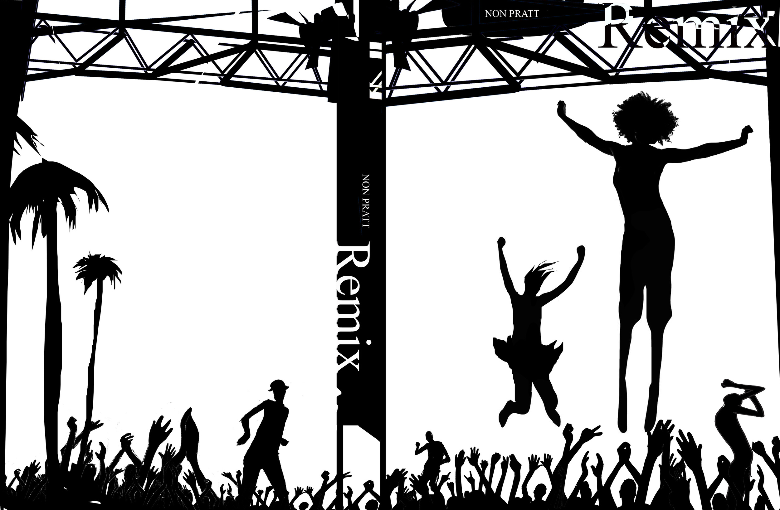
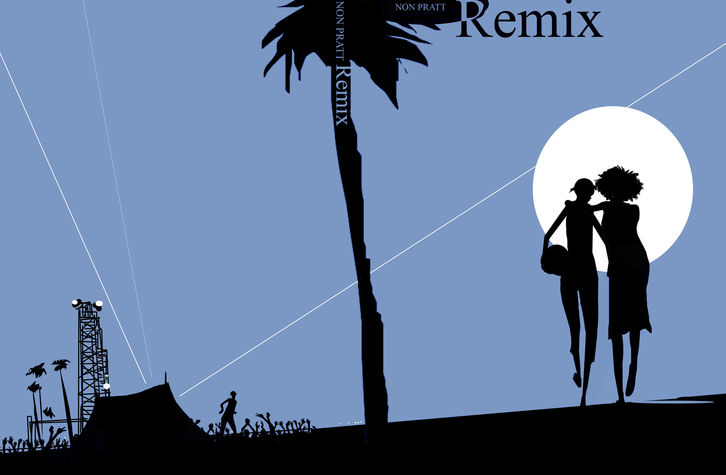
As is de rigueur in today's industry, we wanted to do something illustrated, so designer Lizzy Bromley combed through her tumblr favorites to see who could capture the right spirit. We settled on the brilliant Istvan Banyai, whose work has graced The New Yorker, The New York Times, The Washington Post, and many other fancy publications. After we told Istvan the basic premise of the story, he got to work and delivered many options, like these two:
We loved the energy of the first option and the portrayal of friendship in the second, and we asked Istvan to combine the two while also providing more detail on our protagonists.
After a bit of back and forth, we had an image that we loved, and Lizzy dropped this bomb color and type treatment on it:
That vibrant pinkish red is a fifth color. The full wrap is magnificent--you'll see when you buy the book.
Check out the "Coming Soon" tab to learn more about these books!


